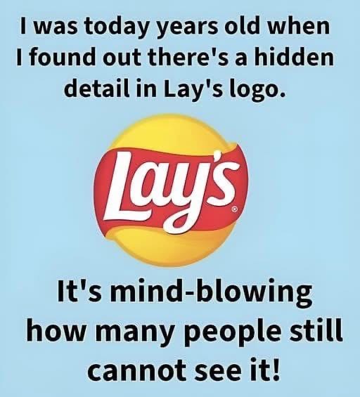
Look closely at the Lay’s logo and you will notice something strangely familiar. That red ribbon shape sweeping across the center is not just a decorative flourish meant to grab attention on a crowded shelf. It mirrors the flowing banner from the old Frito Lay logo, carrying the same gentle curve, the same sense of motion, and the same welcoming personality. Even if most shoppers could not consciously point it out, the shape feels known. It signals continuity, warmth, and trust before a single word is read.
Leave a Reply